Dashboard
KwickMetrics dashboard lets you view all of your important business details and metrics in a single place. You can get details of different periods like Today, Yesterday, Last 7 days, Last 30 days, Last 6 months, Last 12 months, Last year, and This Year from different marketplaces.
All the details are populated in an intuitive user interface with an easy to understand and interactive graphical view.
The following is the list of information you can view in the dashboard,
- Orders
- Units
- Revenue
- Estimated Net Profit
- Splitup
- Profit Margin
- Returns
- Return Percentage
- Return Value
- Trends
- Buyer Segmentation
- Top Performing Products
- Configurable Chart
- Profit & Loss
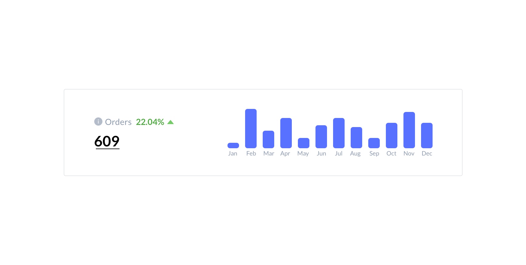
Orders
It shows the total number of shipped and pending orders in a graph using data from all of your selected marketplaces over the chosen period as well as previous periods of sale.
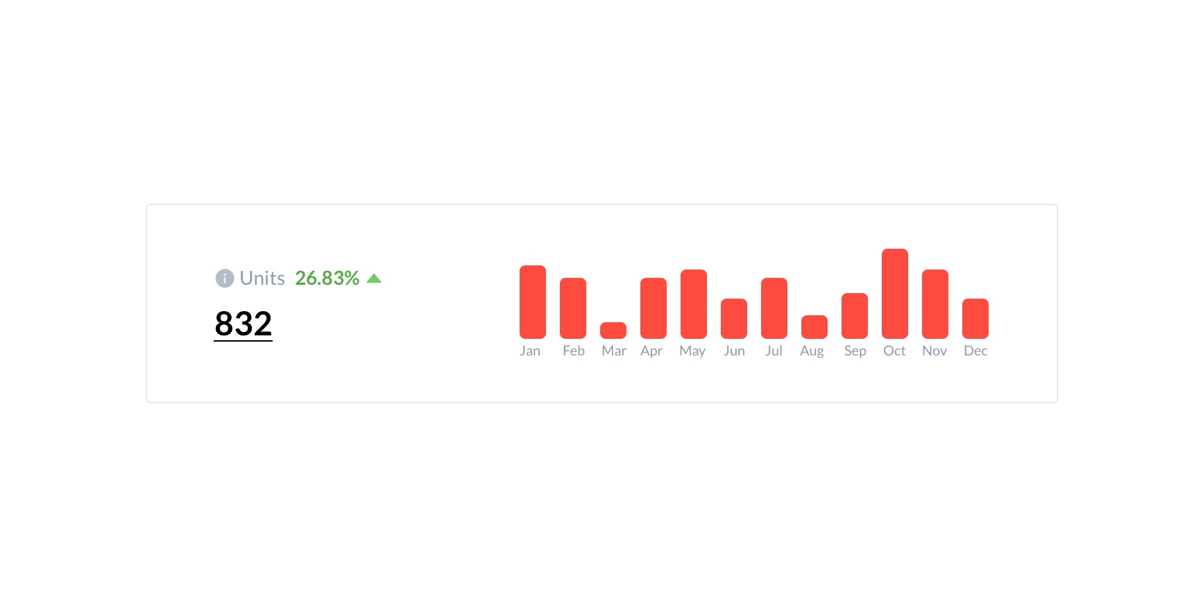
Units
It shows the total number of shipped and pending units in a graph using data from all of your selected marketplaces over the chosen period as well as previous periods of sale.
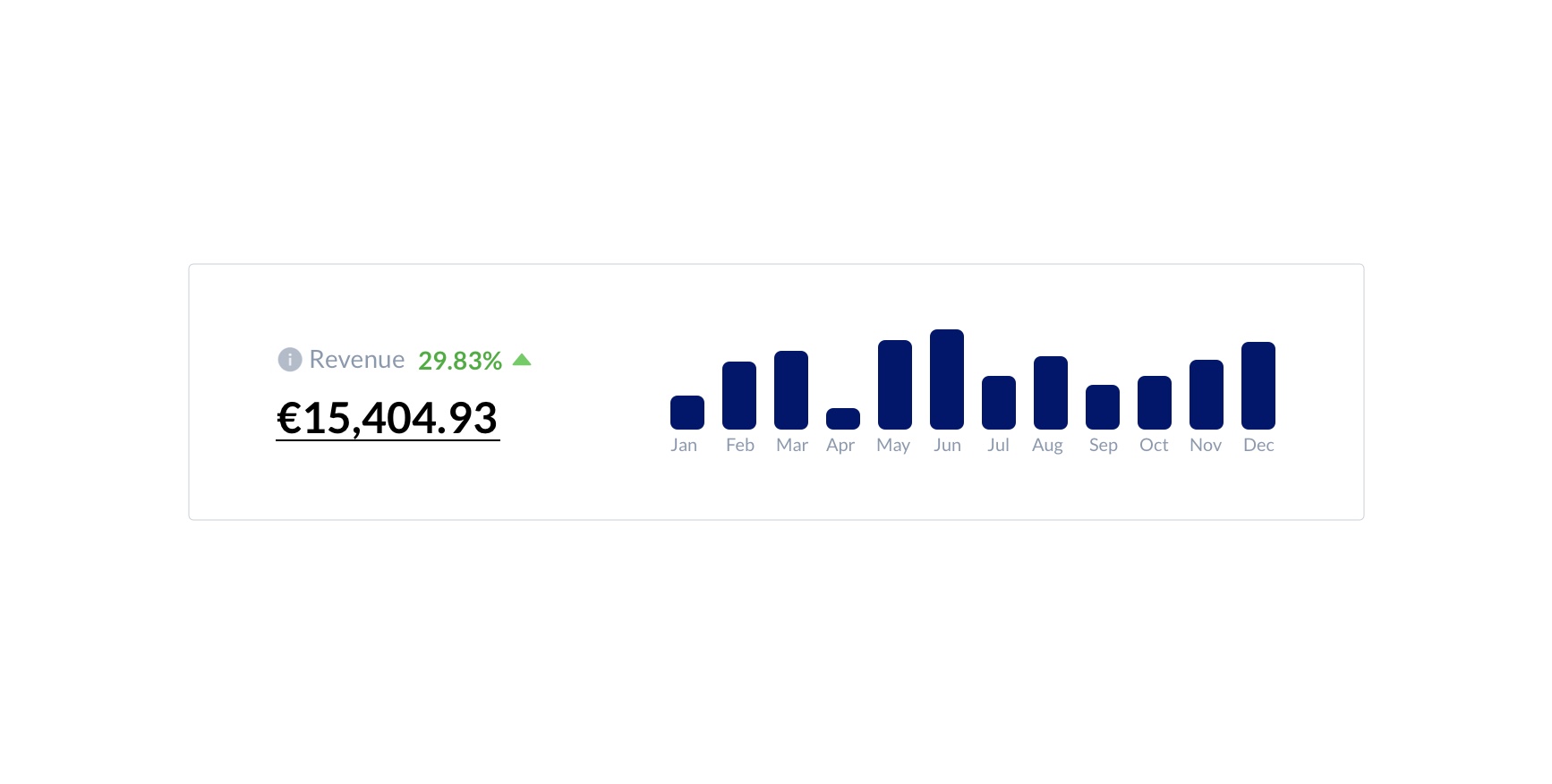
Revenue
It shows the total revenue generated from the total number of received orders/units over the selected period and previous sale periods. Orders with the shipped status are also included while calculating the total revenue. Revenue amounts are displayed based on the base currency chosen in your profile.
Estimated Net Profit
It shows the total estimated net profit for the units sold after deducting Amazon fees and taxes over the selected period, as well as the sale of the previous periods. Revenue amounts are displayed based on the base currency chosen in your profile.
Estimated net Profit = Revenue - Cost
Here, Cost = Amazon fees + Promotions + COGS + Expenses
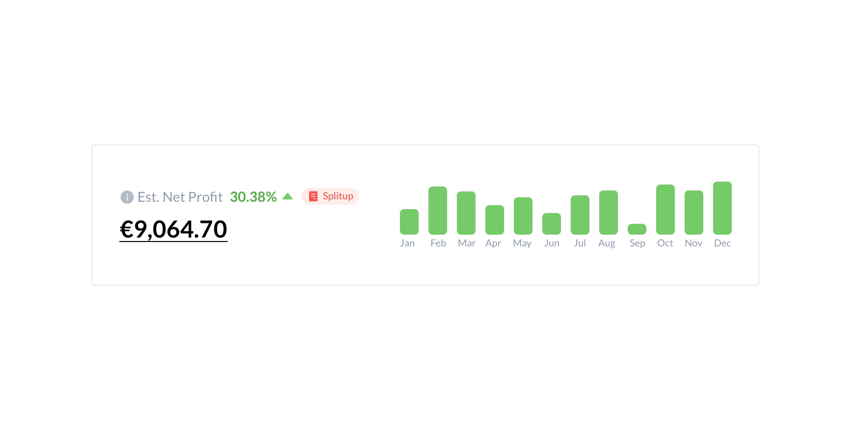
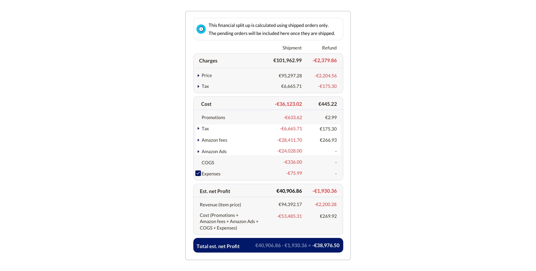
Splitup
The Split-up button ![]() is located next to the estimated net profit value. It shows you the financial split-up of your business's total estimated net profit after deducting tax, Amazon fees, promotions, COGS and Refunds.
is located next to the estimated net profit value. It shows you the financial split-up of your business's total estimated net profit after deducting tax, Amazon fees, promotions, COGS and Refunds.
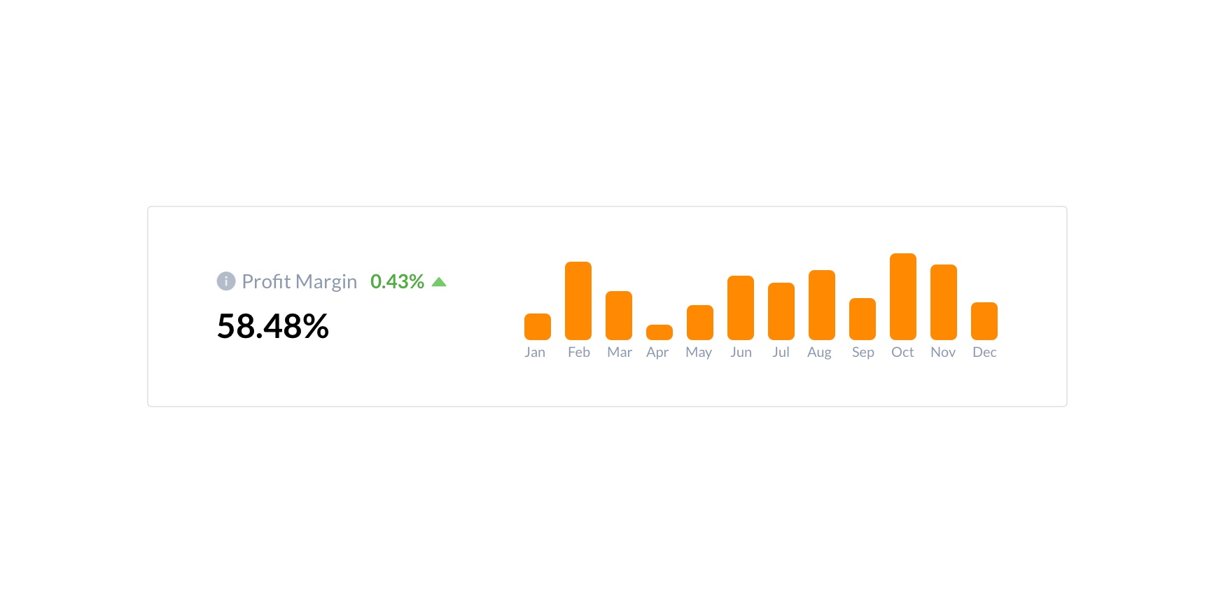
Profit Margin
It shows the profit margins calculated using the revenue and estimated net profit over the selected period and previous sale periods.
Profit Margin = (Est. net profit / Revenue) x 100
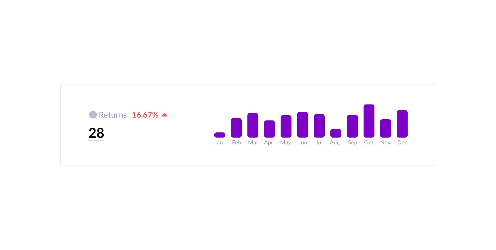
Returns
It shows the number of returned units returned to inventory storage during the selected period and previous periods of sale. It is important to note that this does not correspond to returns that occur on the return date but instead when they have been successfully received at inventory storage.
For example, if a customer returns a product on March 14th and reaches inventory on March 15th, this unit is considered to have been returned on March 15th, and the Return count will reflect so.To help you easily distinguish positive or negative changes in the number of returns received, you can use the coloured markers next to the Return count.
If the number of returns during the current period is more than that of the previous period, the marker will be red ![]() and point upwards.
If the number of returns during the current period is less than the previous period, the marker will be green
and point upwards.
If the number of returns during the current period is less than the previous period, the marker will be green ![]() and point downwards.
and point downwards.
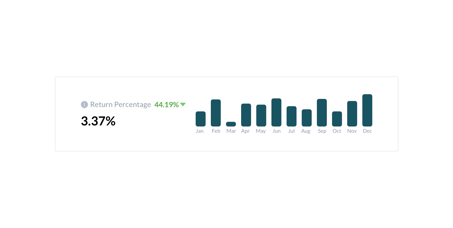
Return Percentage
It shows the percentage of sold units that are returned with the previously compared period .
Return percentage = (Total return units / Total units) x 100
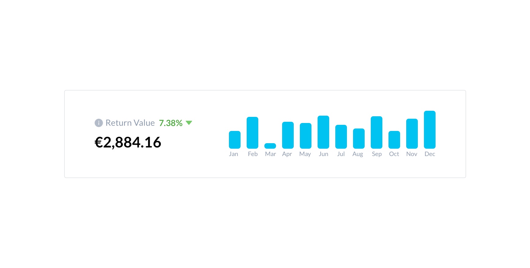
Return Value
It shows the total value of all units returned to inventory during the current period compared to the previous period. This value helps you understand your losses due to returns.
Trends
Trends is a modern line graph and/or table that displays detailed sales behaviour comprising orders, units, and revenue. You can quickly check revenue by just hovering over the line graph at any point in time. Please note that the group by option will be getting displayed according to the chosen date range.
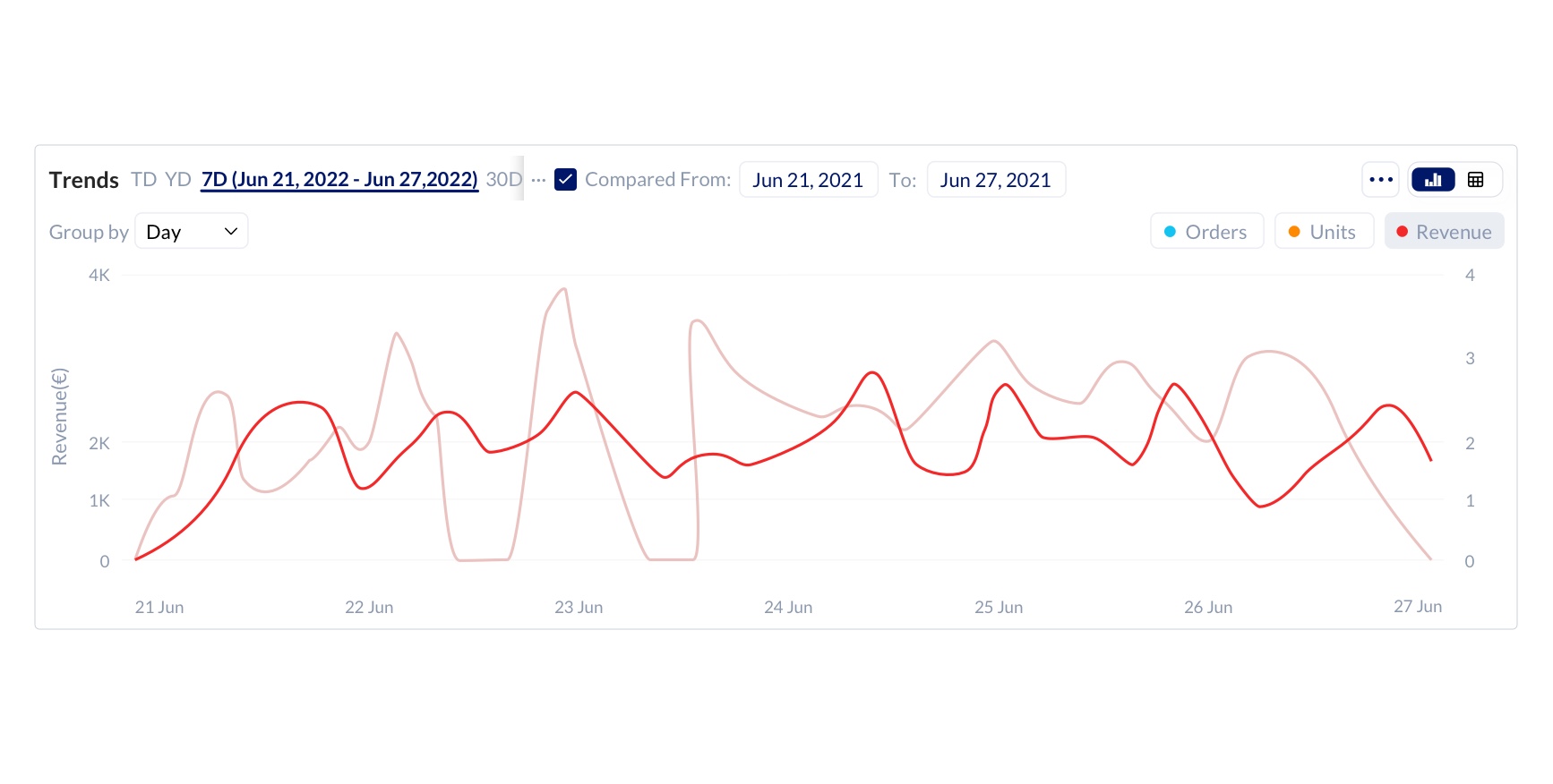
Clicking on the badges(orders, units and revenue ) in the trends chart will add or remove the respective bar in the chart.
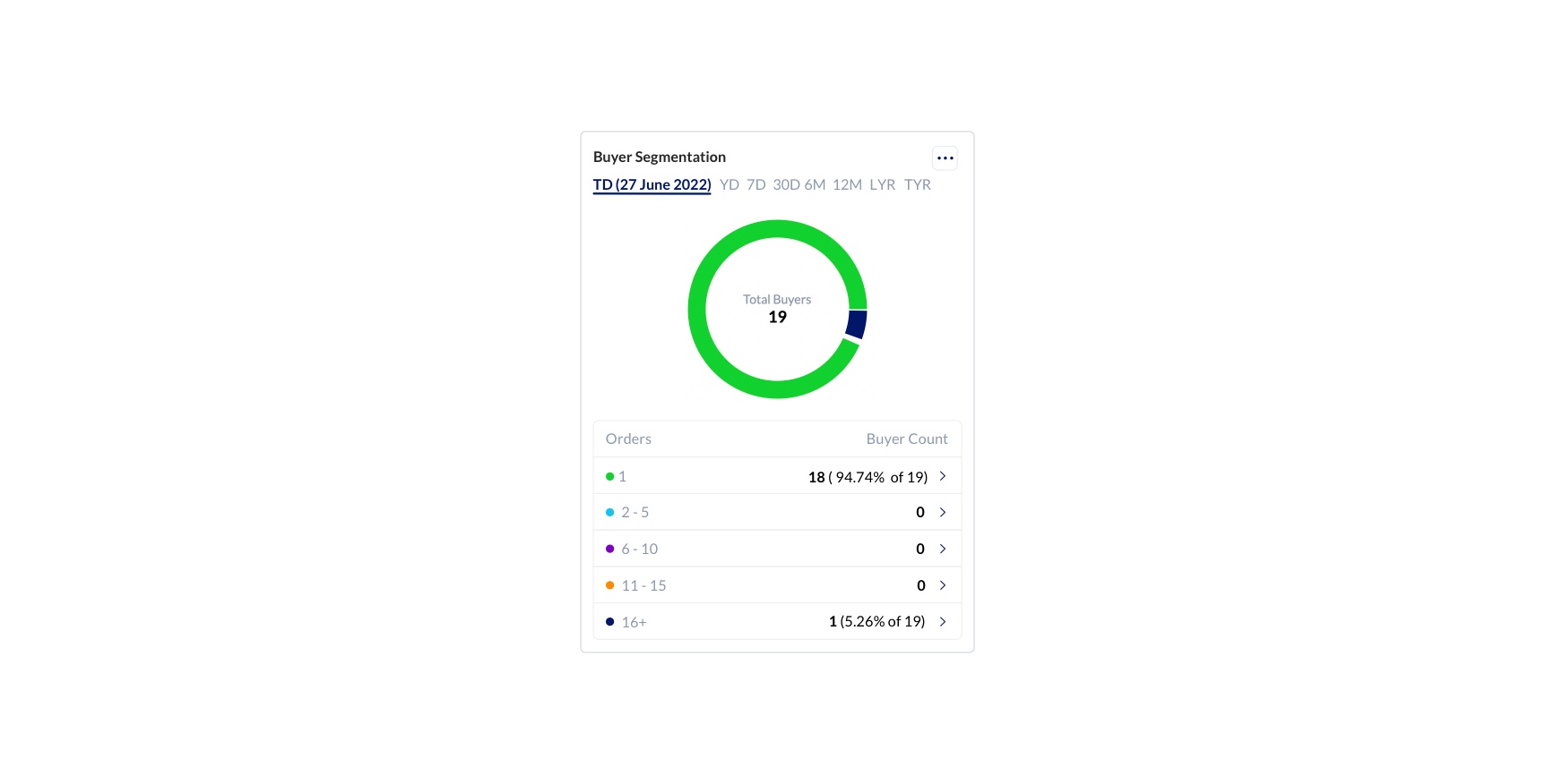
Buyer Segmentation
Understand how many in your demographics are new or repeat buyers. KwickMetrics gives you easy-to-use pie charts that display buyer segmentation in the ranges of 1 order, 2-5 order, 6-10 order, 11-15 order, and 16+ order buyers.
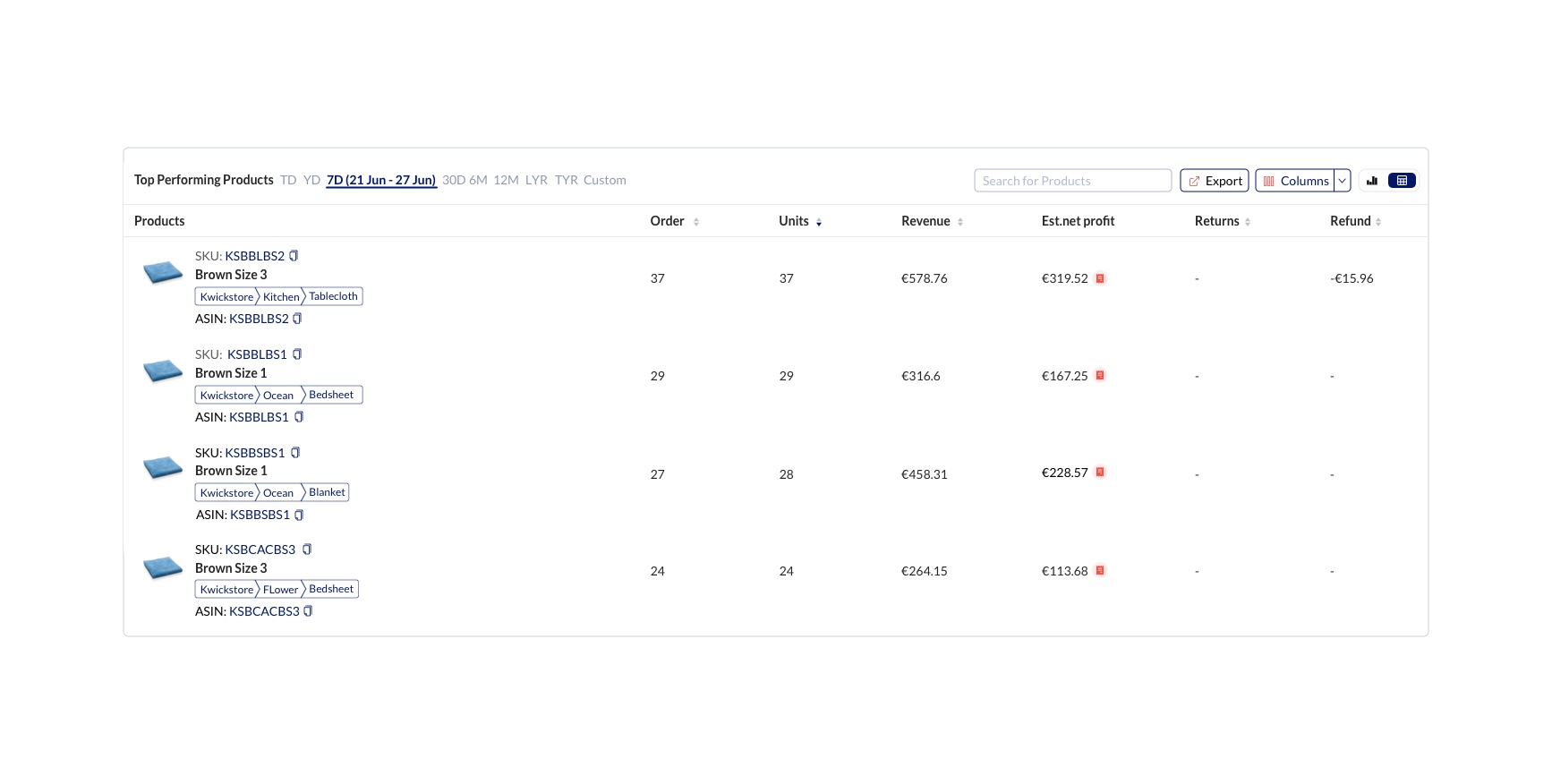
Top Performing Products
This section of the dashboard gives you the details of the top performing products in the Marketplace based on the count of orders, units and revenue. It also gives you the details of the products like Name, Category (displayed in the form of a hierarchical category tree), SKU, ASIN, Orders, Units, Revenue, Refunds, Returns and Est. Net Profit. We can also switch the mode of viewing to bar graph to get a quick insight of the business nature. You can change the sequence of the variables getting displayed by dragging them. This will help you in handling your analysis in a more convenient way. Towards the left of the columns button in the top right corner of the page we have the Export button. Clicking on this will display before you the available options with which you will be able to export the report details either by sending it as a mail or download it as a file. Clicking on the View Export status option will take you to the export option under the gear icon of the app. For more details on the Export status, please Click here.
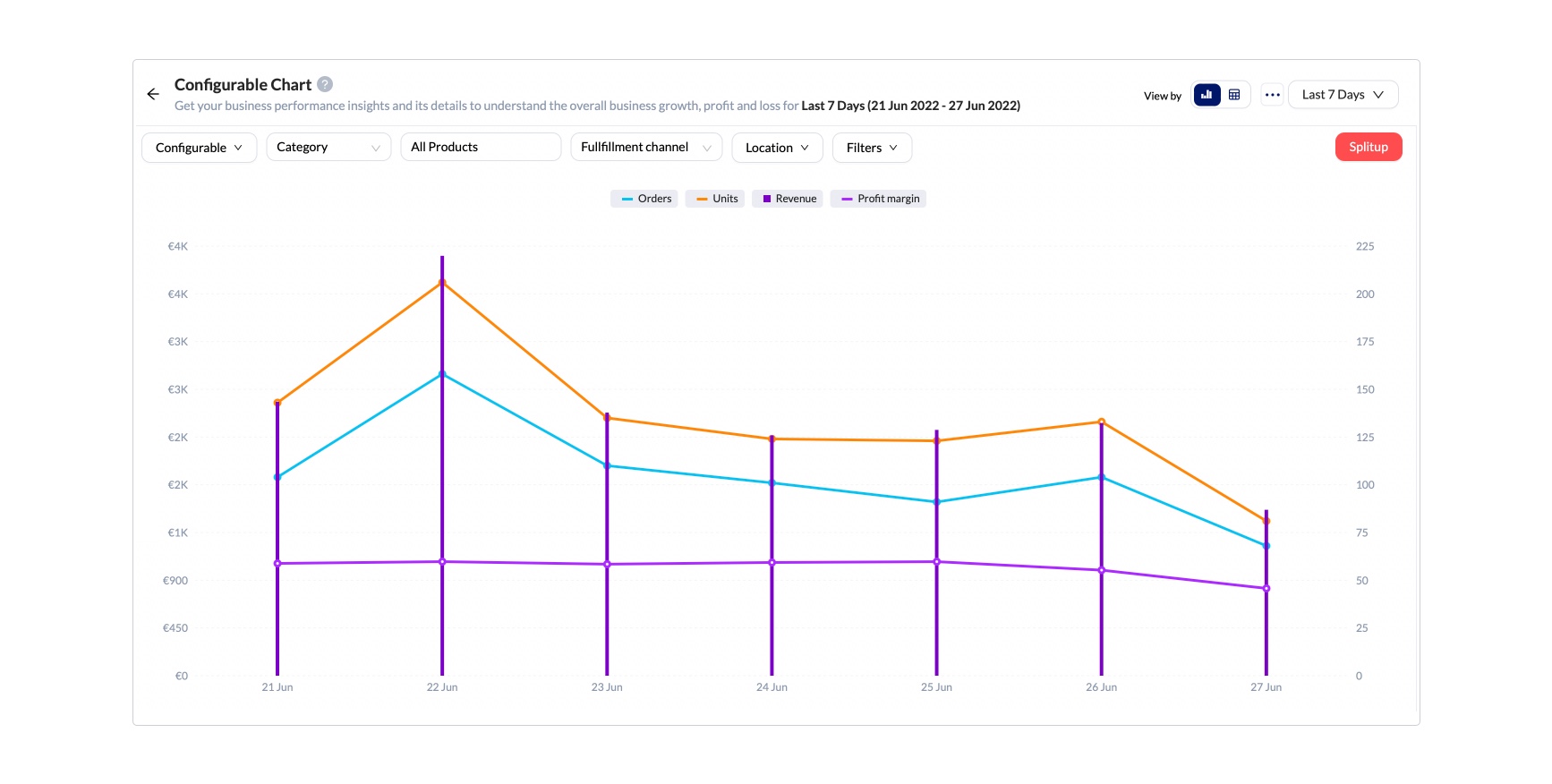
Configurable Chart
Configurable chart gives you business performance insights, so that you can understand your overall business trends. It helps you analyse your Key Performance Indicators.
You can customise basic parameters from sales to returns (i.e. Orders, Units, Revenue, Est.net Profit, COGS, Expenses, Returns, Refund, Promotions, Profit margin, Total buyers, Amazon fees, Returns %, Sellable Returns %, Sponsored Brand, Sponsored Display, and Sponsored Products over various periods (Last 7 days, This Month, Last Month, This Year, Last Year, and custom date). You can change the sequence of the variables getting displayed by dragging them . This will help you in handling your analysis in a more convenient way. You can also configure additional parameters such as products in your custom Category Tree, by SKU name, fulfilment channel (FBA, FBM, or both), by specific location, or via your custom filters. All of this information is displayed in an interactive chart.
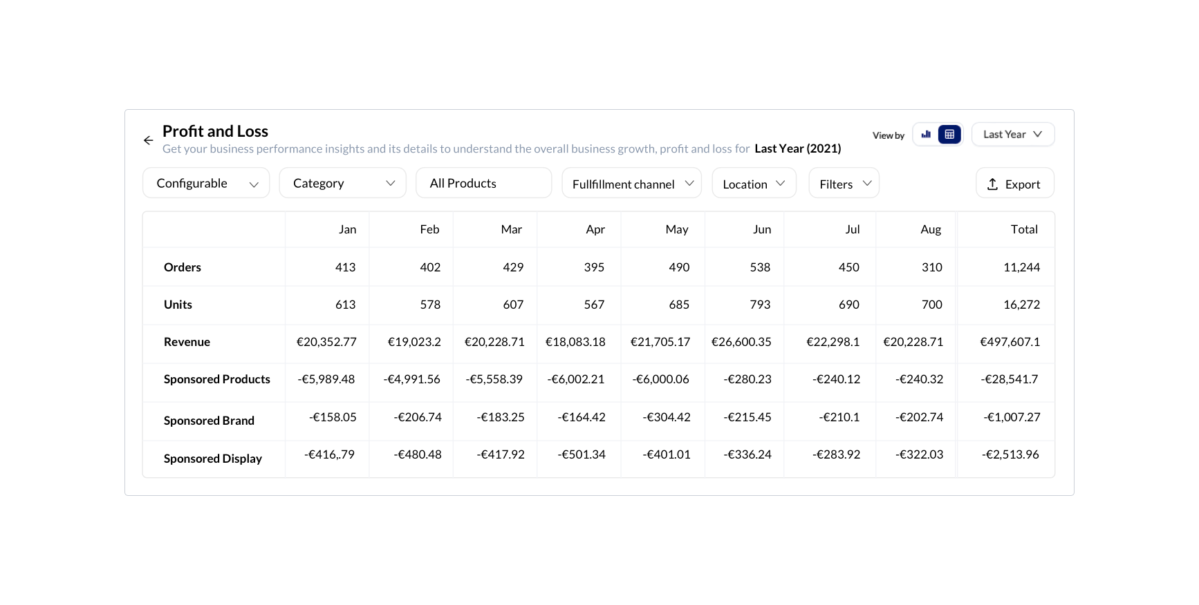
Profit & Loss
Profit & Loss is the tabular form of the configurable chart which displays the detailed profit & loss of your business in numbers rather than trends. You can customise basic parameters under the drop down of Configurable such as Orders, Units, Revenue, Est.net Profit, COGS, Expenses, Returns, Refund, Promotions, Profit Margin, Total buyers, Amazon fees,Returns %, Sellable Returns %, Sponsored Brand, Sponsored Display, and Sponsored Product over various periods.
You can change the sequence of the variables getting displayed, by dragging them. This will help you in handling your analysis in a more convenient way. (Last 7 days, This Month, Last Month, This Year, Last Year, and custom date). You can also configure additional parameters such as products in your custom Category Tree, by SKU name, fulfilment channel (FBA, FBM, or both), by specific location, or via using your custom filters.
Filters
You can filter data in the info cards, trends chart, buyer segmentation and top performing products and list with the help of a wide variety of default filters. The number of filters varies based on the report you are looking at currently.